How Space shapes Collaboration with Clients and other Humans
How does physical space influence collaboration with customers and the customer experience? And how do organizations use physical space to design customer relations? ecloo explored those questions in 3 different organizations: a government agency, a Not-for-Profit and a wholesaler in the construction business.
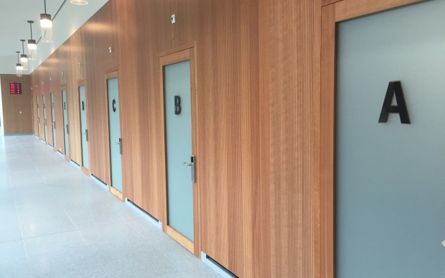
First scene is the local government agency of my home town where new city residents have to register. My wife is moving from France to Winterthur (Switzerland) and we visit the registration agency together for her to follow the necessary procedures to become a legal resident. Through the entrance hall we reach a long hallway, take a number and sit down just like the other people waiting. The building is modern and the light wood creates some warmth. Nevertheless, we do not feel entirely comfortable. Why is that?
The atmosphere feels a bit tayloristic: Long hallways, numbers and letters, closed doors. An elegant machinery breathing efficiency but where one just feels a little lost.
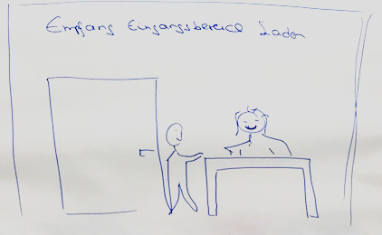
The second part of the journey takes me to Basel to a well-known Not-for-Profit that takes care of the most vulnerable people in society. I consult them and run a workshop with their Executive Team. One of their goals is to better understand their customers (i.e. those most vulnerable people in society) in order to better support them. Accordingly, different improvement measures are vetted. The first point of contact for customers leads through the reception which is located on the 4th floor. Internally, people refer to it somewhat mockingly as the reception wall: Once you have climbed the stairs and enter the reception area, you cannot see if a person is sitting at the reception or not and you almost have to lean over the wall to verify. This first point of contact creates a distance and has symbolic significance so two change scenarios are discussed to answer the question: How can the reception area can be transformed to become more open and human centered?
In the first less costly approach, the reception undergoes little modification: Part of the wall is simply cut out so that every person who makes it up to the 4th floor to access the reception can easily make eye contact. This reduces the distance between the organization and the client and facilitates the process of connecting.
In a second, more visionary solution the reception moves down to the ground floor inside the shop run by the Not-for-Profit. This approach is more costly but also more effective:
The wall is falling: The connection with the client literally happens at eye level and becomes more human. The distance between institution and person diminishes and offers the ideal starting point to better understand the needs and concerns of the clients.
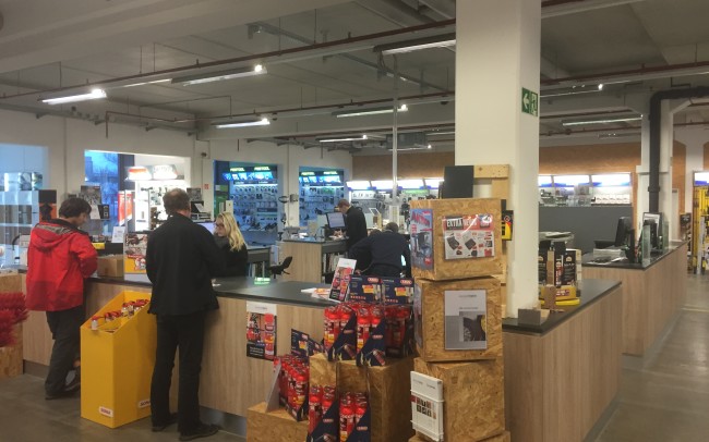
The journey goes further North from Basel to Freiburg im Breisgau (Germany). This is where I meet the owner and CEO of Beschläge Koch, a 3rd generation family business and a regional leader in its field of wholesale in the construction business. I arrive a little early and take the opportunity to look around in the shop. In the middle, I immediately notice a Sales Island with employees in the middle and customers around it. A multitude of products are displayed in the shop: drilling machines, safety clothing, woodworking tools, lighting systems, etc. I am approached without feeling intruded. Even when many clients are in the shop, the atmosphere remains harmonious and relaxed. Sales staff and customers are focused in their conversations:
I feel comfortable here. I look around, am fascinated by the diversity of products and observe without being interrupted. Those impressions continue also during the visit of the company behind the scenes. The owner talks casually yet respectfully with all employees who do not seem to feel controlled by the boss. At the end I am asking the owner how they decided on the design of the shop and the Sales Island in the middle: “We all discussed different options with each other and came to the conclusion that creating an island in the middle is the most effective solution to engage with our customers. And we found no reason why this should harm the current business.” That almost sounded a bit like the holacracy principle according to which anyone can propose a change in the organization unless a case can be made against it showing that such a change would damage the company.
Configuration of space plays an important role in how internal and external collaboration works (or does not work): How do you design your space to promote contact with your clients at eye level in order to better understand them and improve your collaboration with them?


